-
Notifications
You must be signed in to change notification settings - Fork 2
add_cblock
This tutorial is designed for developers looking to extend their project with new components. It serves as a starting point for learning how to create and develop a Content Block. For a more in-depth look at the development process with CMS-KIT, refer to the follow-up tutorials.
By the end of this tutorial, you will have created a new Content Block and made it available for Content Creators.
Approximately 40 minutes
Content Block: A Content Block is a modular unit of your project with the following key attributes: UI, React Component, CMS Schema, and Content Example. Content Blocks are available in the CMS for Content Creators, allowing them to place these blocks on a page and edit the content of each specific block entry. In the project code, Content Blocks are represented by React components, with CMS content passed via props. Typically, Content Blocks have a full-width rectangular UI on a page, with logically tied content that is visually separated from other blocks. They function like "lego" modules used to build an entire landing page. For more details, see the Content Blocks documentation.
Components Set: A Components Set is a collection of Content Blocks and related items such as Sub Blocks, Components, Page templates, queries, schemas, and more. Typically, a Components Set comprises visually and technically compatible parts. For more information, see the Components Set documentation.
Before you begin, ensure that your system is set up and your local development environment is configured. If you haven't done this yet, refer to the "Setting Up the System with CMS-KIT" tutorial.
You must have at least one Components Set installed in your project. For this tutorial, we will assume you have the tw-base Set installed, as all tasks will be based on it. If you started your project from the CMS-KIT-Sanity template, you should already have that Components Set in your src/sets/tw-base folder.
A Components Set may have its own dependencies that need to be installed separately from the project dependencies.
Note: You need to complete this step only once, and only if you haven't done it before.
- Navigate to your Set folder:
cd src/sets/tw-base - Install the dependencies:
pnpm i
Let's start a new Content Block with the help of a generator. Your package.json in the Set root contains a script for that. Launch it with:
pnpm run add:cblockIt will ask you to input the name for your content block and the folder where it will be located. Give it a solid, reasonable name in PascalCase. I will proudly name it "NewBlock" to use in this tutorial.
Add Content Block CLI (Image 1)

After the script is finished, start the NextJS Dev server from the project root:
pnpm run devOpen the landing pages list in your Sanity Studio locally at http://localhost:3000/admin/structure/landing. Create a new page where we will work with our new content block. Set the title to "Testing page" and the slug to "test".
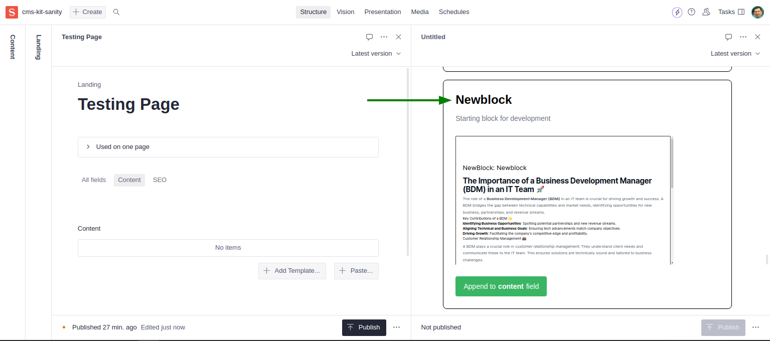
Find the content field on the testing page and press the "+ Add Template..." button. A panel with all available content blocks and their templates will appear on the right. Scroll to find the newly created block.
New Block in Template List (Image 2)
Troubleshooting:
Due to NextJS caching specifics and how initial data is collected in Sanity Studio, you might not see the added Content Block in the templates list immediately. Don't panic and follow these steps:
- Restart the dev server
pnpm run dev- Open Sanity Studio from its main page http://localhost:3000/admin/structure
- Open the document and the templates panel If it doesn't help, run
pnpm run build && pnpm startand repeat steps 2-3.
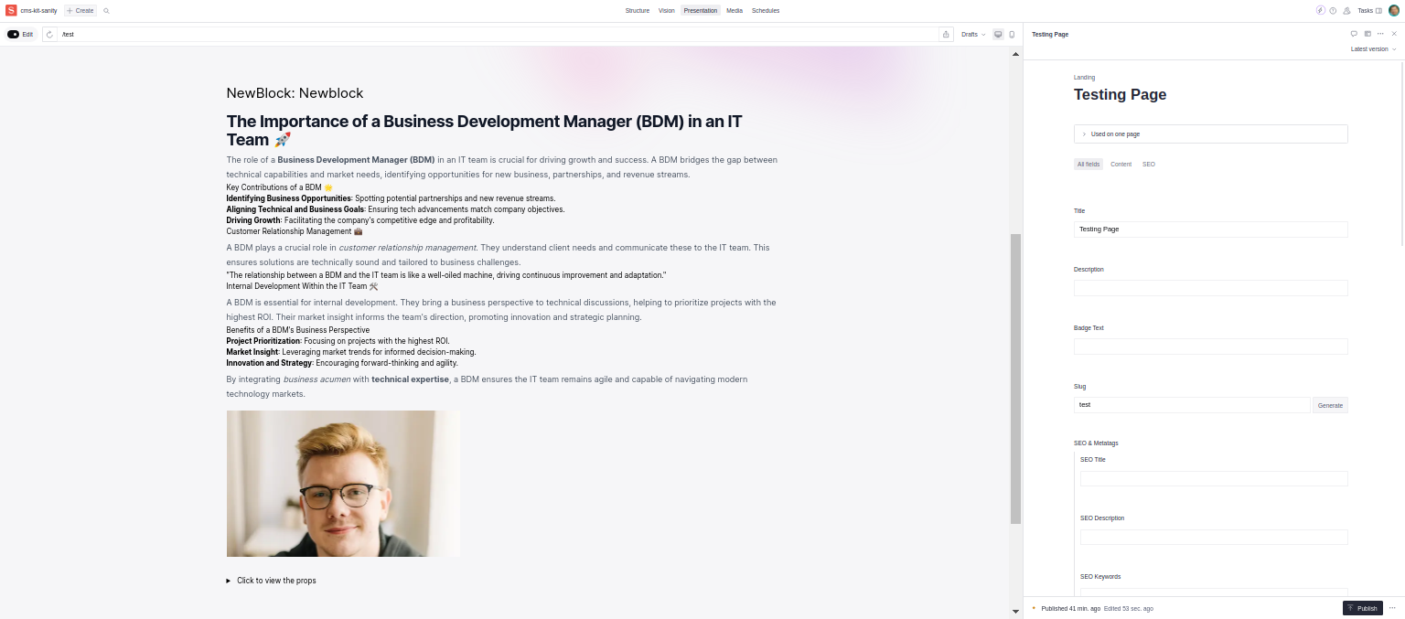
Add this block to your page by pressing the "Append to content fields" button. The block will appear in the list in your page editor with demo content.
New Block in Page Editor (Image 3)
Let's dive into the details about what was added to our project by the generator and how we can work with it.
Code Changes (Image 4)
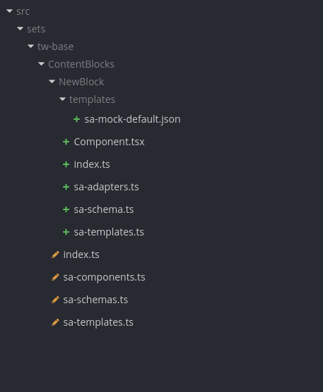
A new folder "NewBlock" was added to the ContentBlocks folder. It contains everything related to the new block. Open src/sets/tw-base/ContentBlocks/NewBlock/Component.tsx in your IDE. You will find the NewBlock React component inside. This is where you define how your Content Block will be rendered on pages and in the "Adding Template" panel in Sanity Studio. Feel free to use your favorite React development practices and organize the code as you see fit.
Note that we wrap our NewBlock component with the withCMS HOC and pass the sa function into it. Open the sa-adapters.ts file and see the code of that function. It has the AdapterFn type. The purpose of adapter functions is to convert data fetched from CMS into React component props.
Why can't we pass data to components directly? Actually, we can, but this approach has some advantages:
- As components from a Components Set are intended to be compatible with different CMSs, we have to adapt them to the content shapes of these CMSs. Despite utilizing the most similar content models for each supported CMS, we can't avoid some tech details leading to slightly different data formats. To overcome this difference, we split our code into a single reusable React component and adapter functions that depend on the CMS.
- We provide some reusable helper components to handle common cases like Images, Links, Formatted text, and so on. To keep components compatible, we convert incoming data into a compatible format when needed.
- You might want to do some preparation work before passing data into component props. For example, the adapter function is a good place for cleaning steganography markers with
@vercel/stega.
Note that point 1 is only for reusable Components Sets. If you're working on a project with a specific CMS and don't plan to share your components, feel free to keep the Adapter Function minimal and organize the rest of the code wherever it's most convenient for you.
For each Content Block, we have to define its schema—the set of fields of a certain type included in the project's content model. When Content Editors work with this block in the CMS and edit its content, they see it in an editor that shows fields specified in the Content Block schema. Open sa-schema.ts and find newBlock—this is the definition of the block's schema. Note that we use some helpers for creating it:
-
defineBlockType: Defines the schema for the content block level. -
imageWithMetadata.name: Use this when you need a field for an image. It has some advantages over the standardimagefield type. -
customRichText.name: Formatted text helper field type. -
blockOptions.name: Common Content Block options you might want to have in your block's schema.
We export the schema definition as follows:
export default [newBlock];This is enough to register this new schema in the project's model. Sometimes you will need to specify additional schemas for your component. Export them as well inside the array:
export default [newBlock, newBlockCard];Templates are predefined content examples for your Content Block. You must have at least one template that will appear in the "Adding Template" panel in the CMS, so Content Creators can select it and add it to a page. Note that a template rendered by a component is the only way Content Creators can recognize and deal with your Content Block. This way, you provide a visual representation of the real appearance, which works better than hundreds of words. We utilize the "Show, don't tell" approach here.
Open the sa-templates.ts file. You will find two important things here: the template definition object of the SanityTemplate type, where you give a name, title, and category to a template, and the newBlockDefaultJSON JSON file that contains the actual data of the initial content. We export templates in a similar way to schemas.
You are encouraged to create multiple templates for each Content Block. Have your Content Block with different theme appearances, layouts, or subcomponents? Create a template for each edge case and show all possible use cases you're providing. Finally, Content Creators can only see the titles and appearances of different blocks and have no idea about the name of the React component rendering it—this is not
within their responsibility scope.
We keep JSON files with templates in a separate templates folder, but you can follow your preferred approach in organizing your code.
Before continuing, it's worth noting that now is a good time to git commit your current progress.
Let's go through the major steps of creating a new content block and get familiar with the main aspects and approaches we consider. I'd prefer to create something simple and bright, so let's pick one of the awesome Flowbite components and combine it into blocks. The Flowbite blocks use a similar concept to our Content Blocks, which makes them fit well for our pages.
Take a look at this block: Flowbite Marketing Portfolio. It has everything we need for our exercise.
Flowbite Marketing Portfolio Block (Image 5)
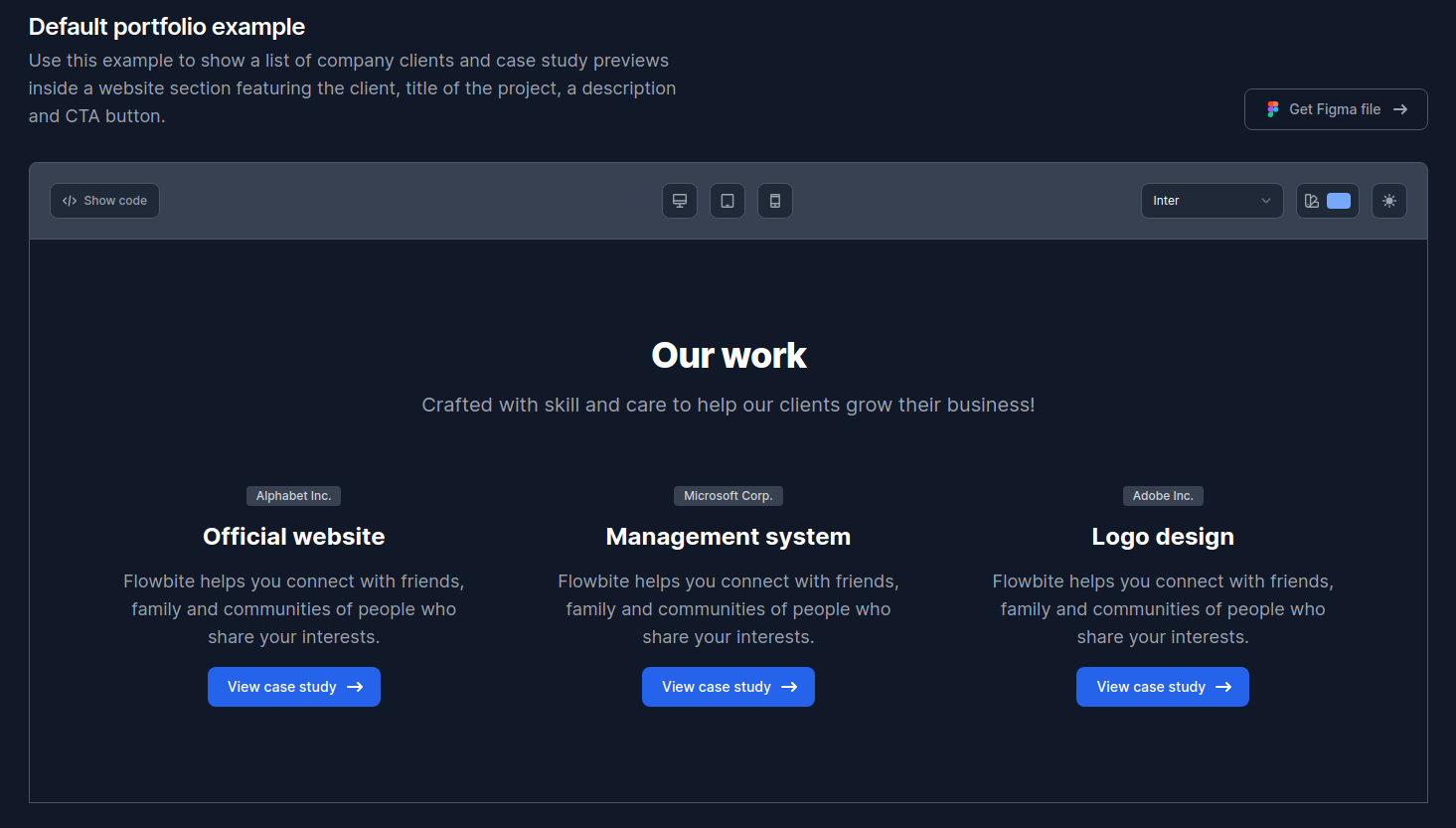
You can grab the HTML code of this component and use it in our project. But we need to convert it into React, separate reusable parts, and turn content copies into props. As experienced React developers, we can skip that part and jump to the moment where we have already prepared code (of course, with ChatGPT's help, never try to do it manually).
Converted Block Code
Resulting React Code:
// Component.tsx

import React from 'react';

const defaultCards: SimpleCardProps[] = [
  {
    company: 'Alphabet Inc.',
    title: 'Official website',
    description:
      'Flowbite helps you connect with friends, family and communities of people who share your interests.',
    link: '#',
  },
  {
    company: 'Microsoft Corp.',
    title: 'Management system',
    description:
      'Flowbite helps you connect with friends, family and communities of people who share your interests.',
    link: '#',
  },
  {
    company: 'Adobe Inc.',
    title: 'Logo design',
    description:
      'Flowbite helps you connect with friends, family and communities of people who share your interests.',
    link: '#',
  },
];

const defaultProps: PortfolioBlockProps = {
  _type: 'tw.newBlock',
  title: 'Our work',
  description:
    'Crafted with skill and care to help our clients grow their business!',
  cards: defaultCards,
};

const ArrowIcon: React.FC = () => {
  return (
    <svg
      aria-hidden="true"
      className="w-5 h-5 ml-2 -mr-1"
      xmlns="http://www.w3.org/2000/svg"
      viewBox="0 0 20 20"
      fill="currentColor"
    >
      <path
        fillRule="evenodd"
        d="M12.293 5.293a1 1 0 011.414 0l4 4a1 1 0 010 1.414l-4 4a1 1 0 01-1.414-1.414L14.586 11H3a1 1 0 110-2h11.586l-2.293-2.293a1 1 0 010-1.414z"
        clipRule="evenodd"
      />
    </svg>
  );
};

type SimpleCardProps = {
  company: string;
  title: string;
  description: string;
  link: string;
};

const SimpleCard: React.FC<SimpleCardProps> = ({
  company,
  title,
  description,
  link,
}) => {
  return (
    <div className="space-y-4">
      <span className="bg-gray-100 text-gray-900 text-xs font-medium inline-flex items-center px-2.5 py-0.5 rounded dark:bg-gray-700 dark:text-gray-300">
        {company}
      </span>
      <h3 className="text-2xl font-bold leading-tight text-gray-900 dark:text-white">
        {title}
      </h3>
      <p className="text-lg font-normal text-gray-500 dark:text-gray-400">
        {description}
      </p>
      <a
        href={link}
        title=""
        className="text-white bg-primary-700 justify-center hover:bg-primary-800 inline-flex items-center focus:ring-4 focus:outline-none focus:ring-primary-300 font-medium rounded-lg text-sm px-5 py-2.5 text-center dark:bg-primary-600 dark:hover:bg-primary-700 dark:focus:ring-primary-800"
        role="button"
      >
        View case study
        <ArrowIcon />
      </a>
    </div>
  );
};

type PortfolioBlockProps = ContentBlockGeneric & {
  title: string;
  description: string;
  cards: SimpleCardProps[];
};

const NewBlock: React.FC<PortfolioBlockProps> = () => {
  const { title, description, cards } = defaultProps;
  return (
    <section className="bg-white dark:bg-gray-900 antialiased">
      <div className="max-w-screen-xl px-4 py-8 mx-auto lg:px-6 sm:py-16 lg:py-24">
        <div className="max-w-2xl mx-auto text-center">
          <h2 className="text-3xl font-extrabold leading-tight tracking-tight text-gray-900 sm:text-4xl dark:text-white">
            {title}
          </h2>
          <p className="mt-4 text-base font-normal text-gray-500 sm:text-xl dark:text-gray-400">
            {description}
          </p>
        </div>
        <div className="grid grid-cols-1 mt-12 text-center sm:mt-16 gap-x-20 gap-y-12 sm:grid-cols-2 lg:grid-cols-3">
          {cards.map((card, index) => (
            <SimpleCard key={index} {...card} />
          ))}
        </div>
      </div>
    </section>
  );
};

export default withCMS({ sa })(NewBlock);
After inserting this code into our Component.tsx file, we can open the /test page in the browser to see the result. Don't forget to update your Tailwind config with values that can be found on a tab next to the "HTML" one in the component section on Flowbite page. Put it into your tailwind.config.ts in the project root.
React Component Rendered (Image 6)
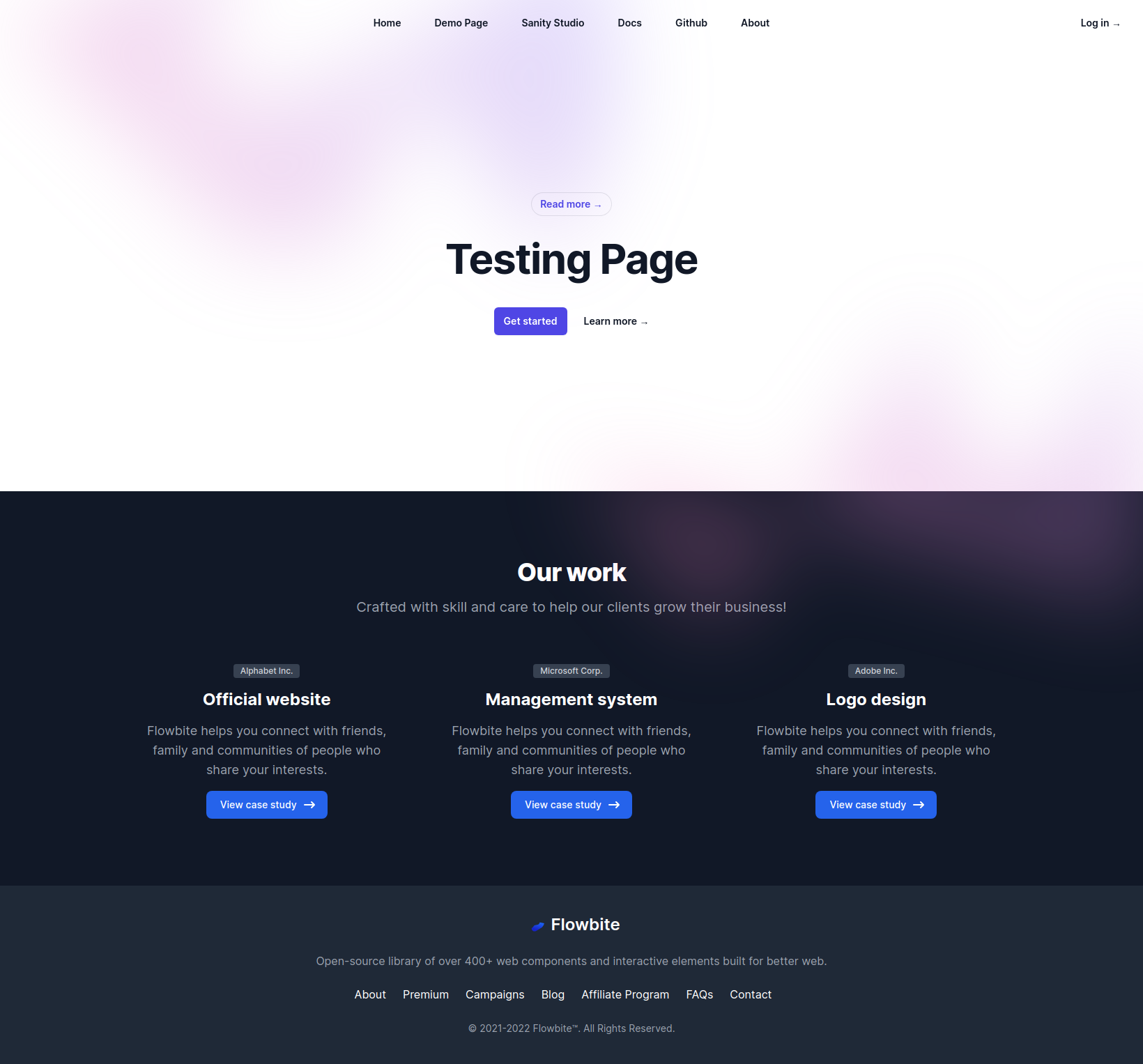
While this looks great, all content is still hardcoded in the component's file, so we can't edit it in the CMS. Let's fix this in the next step.
Now we need to describe our Content Block props in terms of content fields. Let's split it the same way our components are designed: newBlock schema for the main component and simpleCard for the card component. See the schema definition below:
Content Block Schema
// sa-schema.ts

import {
  BlockPreview,
  customRichText,
} from '@focus-reactive/cms-kit-sanity/sanity';
import { defineBlockType, defineComponentType } from '../../sa-config';

export const simpleCard = defineComponentType(({ df }) => ({
  name: 'simpleCard',
  type: 'object',
  title: 'Simple Card',
  fields: [
    df({
      name: 'company',
      type: 'string',
      title: 'Company',
    }),
    df({
      name: 'title',
      type: 'string',
      title: 'Title',
    }),
    df({
      name: 'description',
      type: 'text',
      title: 'Description',
    }),
    df({
      name: 'link',
      type: 'url',
      title: 'Link',
    }),
  ],
}));

export const newBlock = defineBlockType(({ df }) => ({
  name: 'newBlock',
  type: 'object',
  title: 'New Block',
  fields: [
    df({
      name: 'title',
      type: 'string',
      title: 'Title',
    }),
    df({
      name: 'description',
      type: 'text',
      title: 'Description',
    }),
    df({
      name: 'cards',
      type: 'array',
      of: [{ type: simpleCard.name }],
      title: 'Cards',
    }),
  ],
  components: { preview: BlockPreview },
  preview: {
    select: {
      customTitle: 'customTitle',
      components: 'components',
      blockOptions: 'blockOptions',
    },
    // @ts-ignore
    prepare({ components, blockOptions, customTitle }) {
      return {
        title: customTitle || 'Page block',
        customTitle,
        components,
        blockOptions,
      };
    },
  },
}));

export default [newBlock, simpleCard];
Open the page where we have added this Content Block in Sanity Studio and open that block for editing. You will see errors and warnings about the current content. This is fine—Sanity is notifying us that the existing object in the dataset doesn't match the new schema. We are here to fix this. Remove all unnecessary values using the provided buttons or manually. Now let's fill the block with the content we need. You can grab values just from the defaultProps object in your component code. Don't forget to create three cards and fill in their values.
Filling Content in Sanity Studio (Image 7)
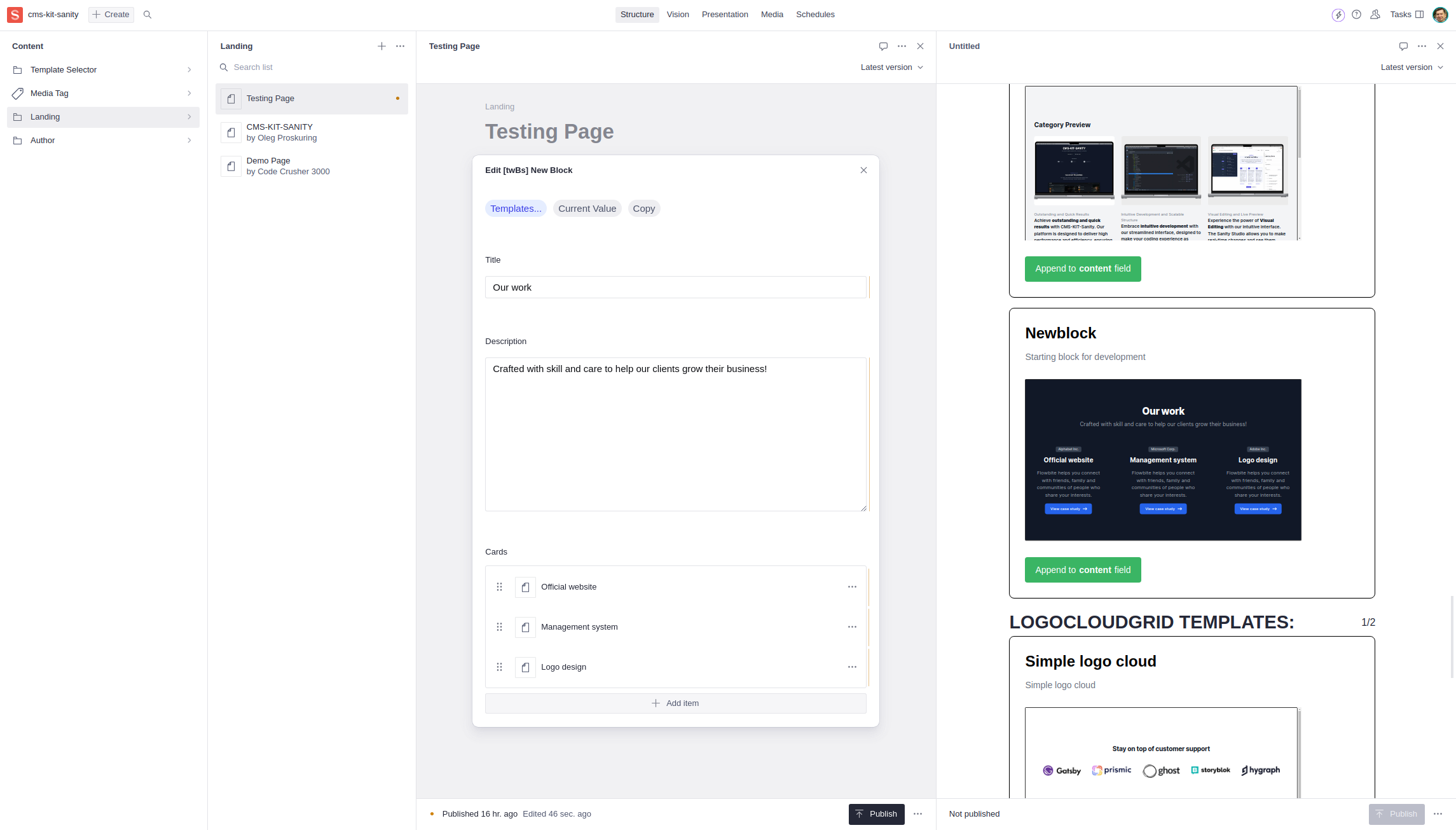
Now we have content in the CMS, but our component still shows hardcoded values. Let's change this.
Let's switch to data coming from the CMS. We can use props passing to the component.
Component Changes for CMS Data (Image 8)

Update the component as shown above. Note that we don't need to touch the adapter function as it's already do what we need.
Now we can spot an issue in our Content Block. We have an array of cards, and now we use array indexes for keys. Our perfectionism demands that we immediately switch to best practices which encourage to use ID or keys values from the CMS for this. Technically we could solve it like this:
{
  cards.map((card) => <SimpleCard key={card._key} {...card} />);
}
But we can use a convenient helper function getCmsKey(contentObject). It remembers how to extract keys from any CMS.
{
  cards.map((card) => <SimpleCardCMS key={getCmsKey(card)} {...card} />);
}Now let's update the template with our new content so it will look exactly the same on the panel. Open this content block in Sanity Studio. Open the "Current Value" dialog window.
Grabbing Current Content Value (Image 9)
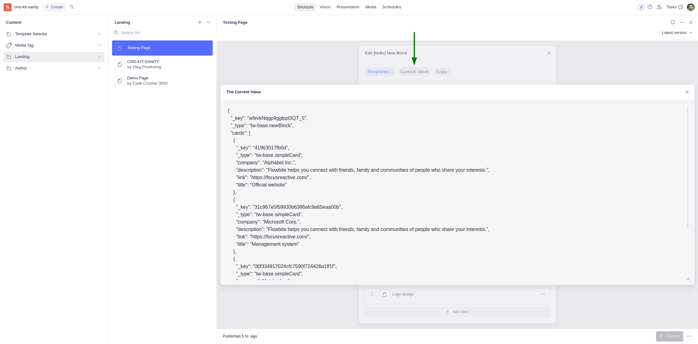
Copy the JSON with the current block content and paste it into templates/sa-mock-default.json. As you save it, you will see the template in the panel in the CMS, and it's available for adding to a page with that saved content.
In sa-templates.ts, we can adjust the title and other details of the template. Let's change some minor details to make it look even clearer for Content Creators:
const newBlockDefault: SanityTemplate = {
  name: 'New Portfolio Block',
  type: newBlock.name,
  namespace: namespace.name,
  title: 'Portfolio',
  description: 'Company portfolio with cards',
  category: TemplateCategory.pageBlock,
  area: TemplateArea.marketing,
  template: newBlockDefaultJSON,
  height: 600 + 4, // 4 is iframe border
};Build the app:
pnpm run build && pnpm startOpen the Sanity Studio and add the new version of the component to the page. You should now see the updated component with dynamic content from the CMS.
With these steps completed, you should have a fully functional Content Block integrated into your CMS-KIT project. Happy coding!
[ Home Page ] [ Github repo ] [ Blog post ] [ Flowbite ]
GitHub Repositories
- https://github.com/focusreactive/cms-kit - CMS-KIT Core
- https://github.com/focusreactive/cms-kit-sanity - CMS-KIT-Sanity starting template
NPM Packages
- @focus-reactive/cms-kit CMS-KIT core package
- @focus-reactive/cms-kit-sanity CMS-KIT-Sanity helper package
Read
https://focusreactive.com/cms-kit-focusreactive/ Blog post
Flowbite
https://flowbite.com/blocks/ - Flowbite blocks library https://flowbite.com/pro/ - Flowbite Pro license