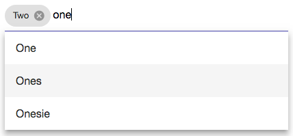
A component library of custom extensions to Angular Material 2.
Important: First make sure you have Angular Material 2 working, by following the steps below.
You'll need to choose a CSS theme from
node_modules/@angular/material/prebuilt-themes
and make it available to your application. If you for example placed it in your assets directory can then link to it like this in your index.html:
<link href="assets/indigo-pink.css" rel="stylesheet">Additionally you'll have to import the Material Design icons. You can use the version hosted by Google by adding the following line to your index.html:
<link href="https://fonts.googleapis.com/icon?family=Material+Icons" rel="stylesheet"><mat-chip-input [options]="['option 1', 'option 2', 'option 3']"></mat-chip-input>| Inputs | Type | Description | Required |
|---|---|---|---|
| options | Array<string> | the list of auto-complete options | yes |
| placeholder | string | placeholder text in input field | no |
| chips | Array<string> | preselected chips | no |
| isOptionsFilter | boolean | filter the options as you type, default = true | no |
| Outputs | Type | Description |
|---|---|---|
| onValueChange | Array<string> | emits the list of chips when a chip is added or removed |
| onIllegalInput | string | emits an error message if the user pressed enter while the input field contains a value that is not a valid option |


