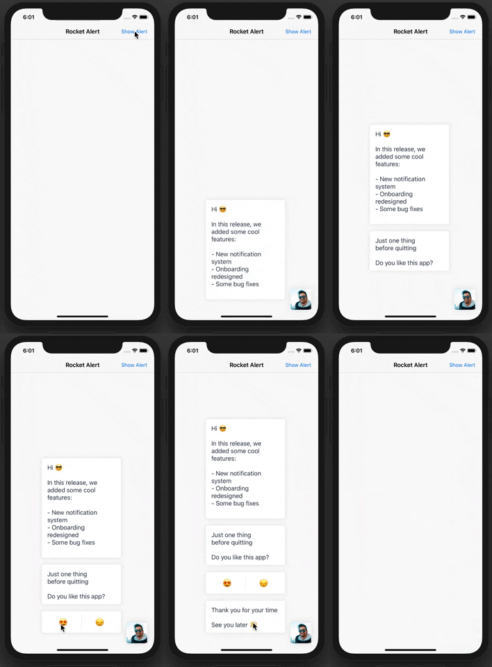
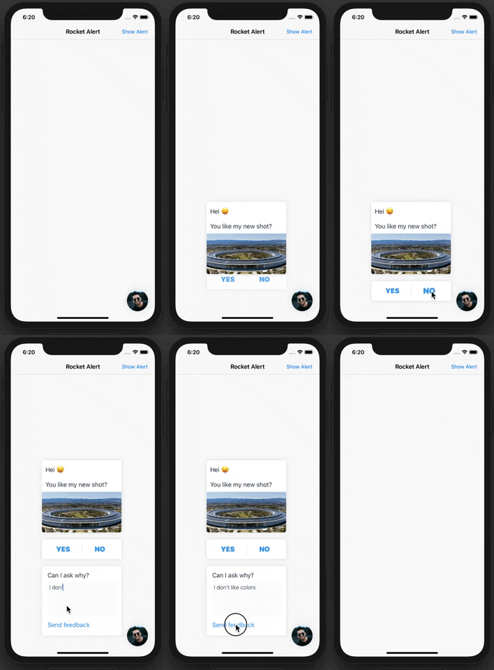
Rockert Alert resolve the problem of being distracted by a boring AlertView with a user-friendly boarding process similar to a Chat Bot.
Would you like to improve your User Experience's while asking user to do some action?
With a modern style and a powerful personalization RocketAlert will help you to increase your conversion rate.
- Installation
- Communication
- Usage
- RocketBlock - The base protocol
- TappableRocketBlock protocol
- TextRocketBlock - Show a line or multiline text
- Flat style - How to write clean and readable blocks
- shownNextAfter: Show next block automatically
- RocketFont - How to change the text style
- ImageRocketBlock - Show an Image with text
- TextRocketBlock - Show a line or multiline text
- ControlRocketBlock protocol
- ButtonRocketBlock - Show a single button
- TapRocketHandler - Handle and show a next block after the TouchUpInside event
- DoubleButtonBlock - Show two buttons
- ButtonRocketBlock - Show a single button
- InputRocketBlock protocol
- TextInputRocketBlock - ask user to enter a text
- InputRocketHandler - depends on input, return a different block
- TextInputRocketBlock - ask user to enter a text
- NotificationCenter Intercept internal notification
platform :ios, '10.0'
use_frameworks!

target '<Your Target Name>' do
    pod 'RocketAlert', '1.0-beta.3'
end
Then, run the following command:
$ pod install
- If you need help, use Stack Overflow. (Tag 'rocketalert')
- If you find a bug or you have a feature request open an issue.
- If you are an 🇮🇹 iOS Italian Developer follow us on Slack or Facebook Group
- If you want to contribute, submit a pull request.
You can instantiate a Rocket by passing to its parameters a RocketAuthor and a RocketBlock object. After that, you can present the Rocket by performing the method show():
import RocketAlert

let author = RocketAuthor(image: yourUIImage, style: RocketImageStyle.round)
let textBlock = TextRocketBlock(text: "This is your first Block")
let rocket = Rocket(author: author, block: textBlock)

rocket.show()
You can destroy the alert by invoking the method dismiss() on the same rocket object:
rocket.dismiss()RocketBlock is a container of data and functionality and under the hood RocketBlock is nothing else than a simple UITableViewCell.
Depends on block type a user can interact with a block by Tap, Control Events (for example button click) and Input Events (at the moment only text input). After an event Rocket can show the next block that has been attached to the interacted block.
RocketBlock is a protocol that gives to all blocks a var id: String? {get set} property (created to be used in some advanced circumstances). There is also a var cellIdentifier: String {get} which is used internally to match the block with a reusable cell.
public protocol RocketBlock {
    var id: String? { get set }
    var cellIdentifier: String { get }
}
The RocketBlock protocol is never used as the base protocol of the implemented class. However, you will use the inherited protocols that give the blocks some useful stuff.
IMPORTANT: When a next block has been presented, the interaction over the previous block will be disabled.
The TappableRocketBlock is an inherited protocol of RocketBlock. The TappableRocketBlock protocol describes the block that can be tapped by the user. It gives to the implemented class two properties:
protocol TappableRocketBlock: RocketBlock {
    var next: RocketBlock? { get set }
    var showNextAfter: TimeInterval? { get set }
}- The
nextproperty represent the nextRocketBlockthat will be shown after the tap. - The
showNextAfterproperty allows the next block, if presented, to be shown automatically after an amount of time. If you provide a value theTapGestureRecognizerwill be disabled.
You can use TextRocketBlock object to show a line or multiline string. The TextRocketBlock is an implemented class of the TappableRocketBlock protocol.
You can create a TextRocketBlock by using one of these init:
TextRocketBlock.init(text: String, next: RocketBlock, showNextAfter: TimeInterval? = nil)
TextRocketBlock.init(text: String, showNextAfter: TimeInterval)
TextRocketBlock.init(text: String, next: RocketBlock? = nil, showNextAfter: TimeInterval? = nil, id: String? = nil, font: RocketFont = .text)
And you can use it like that:
let secondBlock = TextRocketBlock(text: "This is your second block")
let firstBlock = TextRocketBlock(text: "This is your first block", next: secondBlock)

let rocket = Rocket(author: author, block: firstBlock)
rocket.show()
The secondBlock will be presented after the tap on the firstBlock. Pay attention that I passed the firstBlock to the rocket block parameter.
Use this style when you have a lot of blocks and you want to maintain your code clear:
let firstBlock = TextRocketBlock(text: "First")
let secondBlock = TextRocketBlock(text: "Second")
let thirdBlock = TextRocketBlock(text: "Third")

firstBlock.next = second

secondBlock.next = third
secondBlock.font = RocketFont.textBoldlet firstBlock = TextRocketBlock(text: "First")
let secondBlock = TextRocketBlock(text: "Second")
firstBlock.next = second
firstBlock.showNextAfter = 2.0
secondBlock.font = RocketFont.textBoldThe thirdBlock will be shown automatically after 2.0 seconds and after the secondBlock.
You can change the UIFont by providing a RocketFont object to the font property.
let firstBlock = TextRocketBlock(text: "First", next: secondBlock)
firstBlock.font = RocketFont(font: UIFont, color: UIColor)
// or
firstBlock.font = RocketFont.text // the default
The RocketFont provide some default styles:
block.font = RocketFont.emoji
block.font = RocketFont.text
block.font = RocketFont.textBold
block.font = RocketFont.button
block.font = RocketFont.lightButton
block.font = RocketFont.cancelYou can use ImageRocketBlock object to show an Image with or without text. The ImageRocketBlock is a subclass of the TextRocketBlock one, so you can edit the same properties.
You can instatiate an ImageRocketBlock by using one of these init:
ImageRocketBlock.init(image: UIImage, text: String?)
ImageRocketBlock.init(image: UIImage, text: String?, next: RocketBlock?, showNextAfter: TimeInterval?, id: String?)
You can add a padding to the internal ImageView by changing the properties paddingLeft and paddingRight. The default padding value is 0:
imageBlock.paddingLeft = 10
imageBlock.paddingRight = 10
And you can round the corners of the ImageView by assigning a RocketImageStyle to the imageStyle property. The default value is .square:
imageBlock.imageStyle = .circular
imageBlock.imageStyle = .round
imageBlock.imageStyle = .square
The ControlRocketBlock is an inherited protocol of RocketBlock. The ControlRocketBlock protocol describes the interactable blocks.
Use ButtonRocketBlock object to show a single button. Inside the init you won't be able to define a next block directly. However, you'll need to provide a TapRocketHandler object which will let you define a custom action and the next block (it will be fired after the TouchUpInside event).
You can create a ButtonRocketBlock using one of these init:
ButtonRocketBlock.init(title: String, tapHandler: TapRocketHandler)
ButtonRocketBlock.init(title: String, tapHandler: TapRocketHandler, font: RocketFont)
ButtonRocketBlock.init(title: String, tapHandler: TapRocketHandler? = nil, font: RocketFont? = RocketFont.button, id: String? = nil)
The default RocketFont is .button.
let button = ButtonRocketBlock(title: "PRESS HERE")
let afterTheTapOnButton = TextRocketBlock(text: "You press the button!!")

button.tapHandler = TapRocketHandler(next: afterTheTapOnButton, action: {
    print("the user click the button")

    UNUserNotificationCenter.current().requestAuthorization(options:[.badge, .alert, .sound]) { (granted, error) in

    }
})

let rocket = Rocket(author: author, block: button)
rocket.show()Use the DoubleButtonRocketBlock whenever you want to show two options. You can initialize a DoubleButtonRocketBlock passing to its init two ButtonRocketBlock. It's important to know that the touch over the block will be disabled when a user taps to one of the buttons.
let leftButton = ButtonRocketBlock(title: "Left Button")
leftButton.font = .button // the default

let rightButton = ButtonRocketBlock(title: "Right Button")
rightButton.font = .lightButton
rightButton.tapHandler = // remember to set a tapHandler if you want to show a block or if you want perform an action

let doubleButton = DoubleButtonRocketBlock(left: leftButton, right: rightButton)The InputRocketBlock is an inherited protocol of RocketBlock. The InputRocketBlock protocol describes the block that has an input field. It gives to the implemented class an InputRocketHandler<InputType> properties:
protocol InputRocketBlock: RocketBlock {
    associatedtype InputType
    var handler: InputRocketHandler<InputType>? { get set }
}
When you create an InputRocketHandler<T> you need to define a closure that returns back at least one RocketBlock:
public struct InputRocketHandler<T> {
    public init(action: ((T)->(RocketBlock?))?) {
        self.action = action
    }

    internal let action: ((_ text: T)->(RocketBlock?))?
}Use the TextInputRocketBlock whenever you want to ask the user to enter some String information. The TextInputRocketBlock is an implemented class of the InputRocketBlock protocol.
You can create a TextInputRocketBlock by using one of these init:
TextInputRocketBlock.init(text: String, buttonTitle: String)
TextInputRocketBlock.init(text: String, buttonTitle: String, inputHandler: InputRocketHandler<String>?)
TextInputRocketBlock.init(text: String, buttonTitle: String, inputHandler: InputRocketHandler<String>?, id: String? = nil, font: RocketFont? = RocketFont.text, buttonStyle: RocketFont? = RocketFont.lightButton)
This is an easy way you can use it:
let input = TextInputRocketBlock(text: "Describe your problem:", buttonTitle: "Send")

input.handler = InputRocketHandler<String>(action: { (input) -> RocketBlock? in
    return TextRocketBlock(text: "Thanks you so much!")
})If you want to handle the user's input in a different way, you can return a block based on the value of the InputRocketHandler:
let input = TextInputRocketBlock(text: "Describe your problem:", buttonTitle: "Send")

input.handler = InputRocketHandler<String>(action: { (input) -> RocketBlock? in
    if (input.isEmpty) {
        return TextRocketBlock(text: "Why haven't added a text? :(")
    }

    if (input == "SecretKey") {
        return TextRocketBlock(text: "Awesome!! you know the secret key")
    }

    let block = TextRocketBlock(text: "Thanks you so much!")
    /* you can concatenate more blocks if you want */
    return block
})You can subscribe your objects at Notification.Name.rocketBlockAddedEvent. to perform some custom actions. This event will be fired after a block is displayed on the screen.
The userInfo will bring with itself the index and the block presented.
// subscribe to the Notification.Name.rocketBlockAddedEvent
NotificationCenter
    .default
    .addObserver(self,
                 selector: #selector(ViewController.handleRocketAlertBlock),
                 name: Notification.Name.rocketBlockAddedEvent,
                 object: nil)


// handle the notification
@objc func handleRocketAlertBlock(_ sender: Notification) {
    guard
        let index = sender.userInfo?["index"] as? Int,
        let block = sender.userInfo?["block"] as? RocketBlock
    else { return }

    print(index, block)
}
rocketDismissEvent will be fired when rocket is dismissed (after the last block or after clicking to the close button). Inside the userInfo you will find the count of all blocks displayed and the blocks array:
NotificationCenter
    .default
    .addObserver(self,
                 selector: #selector(ViewController.handleRocketAlertBlock),
                 name: Notification.Name.rocketDismissEvent,
                 object: nil)


@objc func handleRocketDismissEvent(_ sender: Notification) {
    guard
        let count = sender.userInfo?["count"] as? Int,
        let blocks = sender.userInfo?["blocks"] as? [RocketBlock]
        else { return }

    print(count, blocks)
}


