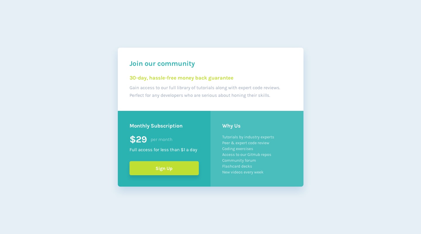
Source of the project from frontendmentor.io.
This is my 9th Frontend Mentor challenge.
This is my solution to the Single price grid component challenge on Frontend Mentor.
Your users should be able to:
- View the optimal layout for the component depending on their device's screen size
- See a hover state on desktop for the Sign Up call-to-action
For this project i used:
- Semantic HTML5 markup
- CSS custom properties
- Flexbox
- Mobile-first workflow
- Adobe Xd - I use adobe xd to check the size of elements.
- I don't have sketch or figma files. So the final result isn't pixel perfect.
- I want to say Thanks to anyone who see my work and react with it, give me his feedback and helped me to improve myself. So thank you❤.
- My website - Well I haven't made my portfolio yet, but gonna make it soon.
Github - @FedLover
Codepen - @FedLover
 Frontend Mentor - @mo
See you in another project! 👋👩💻
