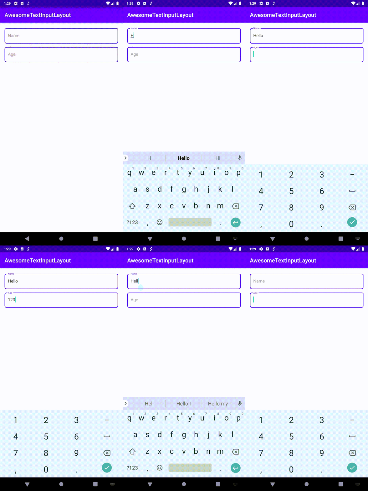
An EditText decorator inspired by the EditText fields in Add New Contact screen of Google's Contact App. EditText is surrounded by a rounded rectangle border. Whenever the edit text receives focus and is empty, Hint is travelled to the top and be part of the border. When it loses focus and still is empty Hint travels back to the original position
Add below code to your root build.gradle file (if you have multiple modules and only one of them require AwesomeTextInputLayout, add the jcenter() repository only in that module's build.gradle).
allprojects {
    repositories {
        jcenter()
    }
}
And add the following dependency code to your module's build.gradle file.
dependencies {
    implementation "ss.anoop:awesome-textinput-layout:${latest-version}"
}
AwesomeTextInputLayout is added a the immediate parent of the EditText you want to decorate. Below is a simple example
<ss.anoop.awesometextinputlayout.AwesomeTextInputLayout
        android:layout_width="match_parent"
        android:layout_height="wrap_content"
        app:borderColor="#5300e8"
        app:borderWidth="2dp"
        app:cornerRadius="8dp"
        android:padding="16dp">

        <EditText
            android:layout_width="match_parent"
            android:layout_height="wrap_content"
            android:hint="Name" />

</ss.anoop.awesometextinputlayout.AwesomeTextInputLayout>Table below describes the properties available to customize the AwesomeTextInputLayout.
| Property Name | Format | Description |
|---|---|---|
| borderColor | color | It defines the color of the border |
| borderWidth | dimension | defines the width of border (border stroke width) |
| cornerRadius | dimension | defines corner radius of border |
| padding | dimension | use padding to adjust the space between border and EditText |
| animationDuration | integer | defines the time for the hint animation |
| animatedTextSize | dimension | defines the text size of hint when edit text is in focus |
Support it by joining stargazers for this repository. ⭐
Copyright 2020 anoop44 (Anoop)

Licensed under the Apache License, Version 2.0 (the "License");
you may not use this file except in compliance with the License.
You may obtain a copy of the License at

   http://www.apache.org/licenses/LICENSE-2.0

Unless required by applicable law or agreed to in writing, software
distributed under the License is distributed on an "AS IS" BASIS,
WITHOUT WARRANTIES OR CONDITIONS OF ANY KIND, either express or implied.
See the License for the specific language governing permissions and
limitations under the License.


