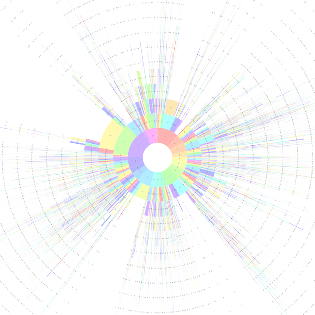
This is a Python Script to generate Sunburst Charts that visualise the structure of English words.
An example chart, generated using the 100,000 most common words in the Google Books English Corpus is shown below:
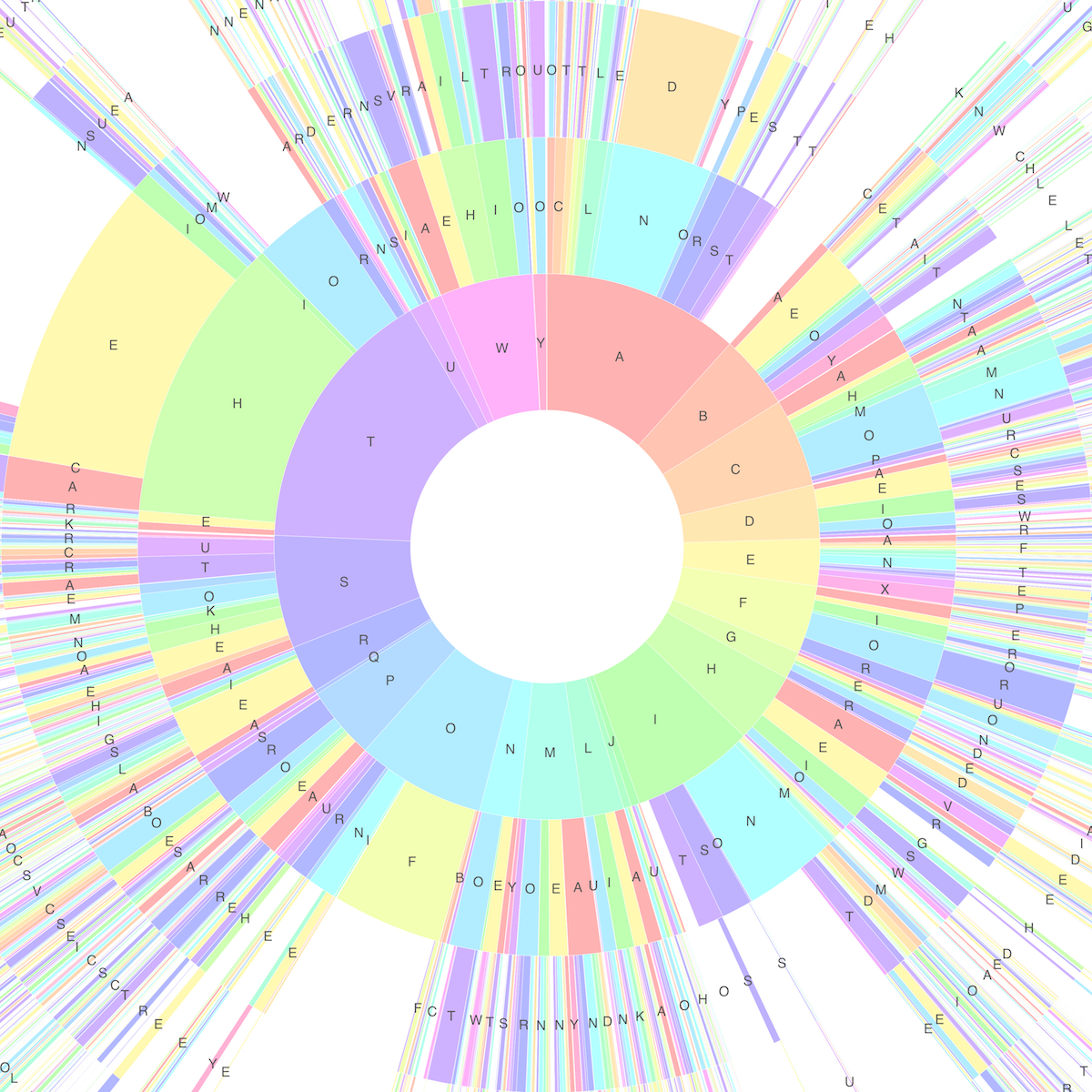
The charts consist of a series on concentric rings, with each ring divided into segments.
The rings represent letter positions within words - the innermost ring corresponds to first letters, the next ring to second letters, and so on.
Each segment within a ring represents a particular letter, occurring at that position within a word, and following the letter adjacent to it on the previous ring. The size of each segment represents how often that letter appears in that position within the corpus. For example, by looking at the innermost ring we can see that the most common letter to find at the start of a word is 'T':
Many of the common words found in the corpus can be seen on the chart by starting at the inner ring and reading radially outwards. For example, the word 'THE' can be seen in the diagram above, at the 10 o'clock position.
Before running the script you must prepare a correctly formatted text file containing a list of word frequency counts such as this one.Run the script with 2 command-line arguments indicating the location of the word file, and the desired output file name. For example:
python wordvis.py google-books-common-words.txt words.svg
The charts are generated in SVG format, and the resulting files are large. The SVG file generated using the Google Books data was around 42MB in size.

